Chapter 6
Designing UI Using Stack Views

To the user, the interface is the product.
- Aza Raskin
I have given you a brief overview of auto layout. The examples that we have worked on were pretty easy. However, as your app UI becomes more complex, you will find it more difficult to define the layout constraints for all UI objects. Starting from iOS 9, Apple introduced a powerful feature called Stack Views that would make our developers' life a little bit simpler. You no longer need to define auto layout constraints for every UI objects. Stack views will take care of most of that.
In this chapter, we will continue to focus on discussing UI design with Interface Builder. I will teach you how to build a more comprehensive UI, which you may come across in a real-world application. You will learn how to:
- Use stack views to lay out user interfaces.
- Use image views to display images.
- Manage images using the built-in asset catalog.
- Adapt stack views using Size Classes.
On top of the above, we will explore more about auto layout. You'll be amazed how much you can get done without writing a line of code.
What is a Stack View
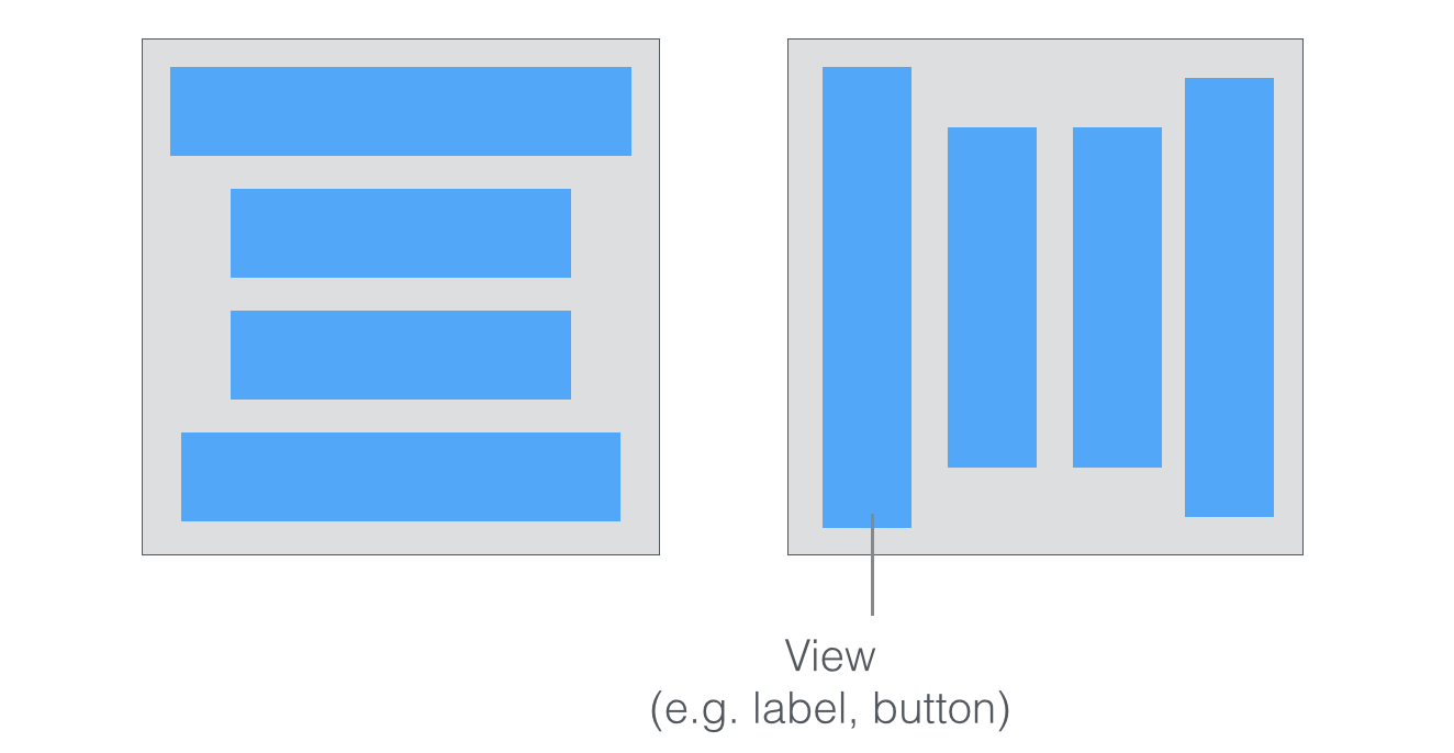
First things first, what is a stack view? The stack view provides a streamlined interface for laying out a collection of views in either a column or a row. In Keynote or Microsoft Powerpoint, you can group multiple objects together so that they can be moved or resized as a single object. Stack views offer a very similar feature. You can embed multiple UI objects into one by using stack views. In most cases, for views embedded in a stack view, you no longer need to define auto layout constraints.
Quick note: For views embedded in a stack view, they are usually known as arranged views.
The stack view manages the layout of its subviews and automatically applies layout constraints for you. That means the subviews are ready to adapt to different screen sizes. Furthermore, you can embed a stack view in another stack view to build more complex user interfaces. Sounds cool, right?
Don’t get me wrong. It doesn’t mean you do not need to deal with auto layout. You still need to define the layout constraints for the stack views. It just saves you time from creating constraints for every UI element and makes it super easy to add/remove views from the layout.
Xcode provides two ways to use stack view:
- You can drag a Stack View (horizontal / vertical) from the Object library, and put it right into the storyboard. You then drag and drop view objects such as labels, buttons, image views into the stack view.
- Alternatively, you can use the Stack option in the auto layout bar. For this approach, you select two or more view objects and then choose the Stack option. Interface Builder then embeds the objects into a stack view and resizes it automatically.
If you still have no ideas about stack views, no worries. We’ll go through both approaches in this chapter. Just read on and you’ll understand what I mean in a minute.
The Sample App
Let’s first take a look at the demo app we’re going to build. I will show you how to lay out a welcome screen like this using stack views:
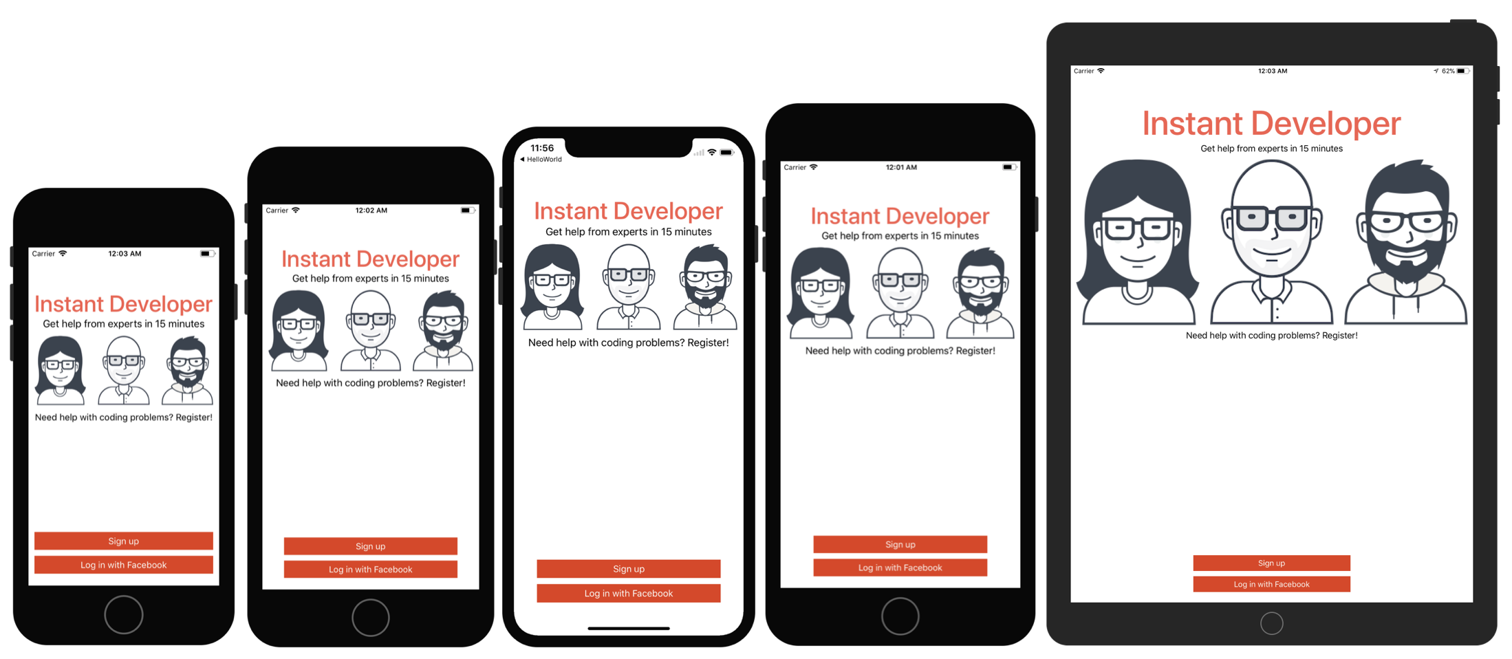
You can create the same UI without using stack views. But you will soon see how stack views completely change the way how you layout user interfaces. Again, there is no coding in this chapter. We will just focus on using Interface Builder to build an adaptive user interface. This is a crucial skill you will need in app development.
Creating a New Project
Now fire up Xcode and create a new Xcode project. Choose Application (under iOS) > "Single View Application" and click "Next". You can simply fill in the project options as follows:
- Product Name: StackViewDemo – This is the name of your app.
- Team: Just leave it as it is.
- Organization Name: AppCoda – It's the name of your organization.
- Organization Identifier: com.appcoda – It's actually the domain name written the other way round. If you have a domain, you can use your own domain * name. Otherwise, you may use "com.appcoda" or just fill in "edu.self".
- Bundle Identifier: com.appcoda.StackViewDemo - It's a unique identifier of your app, which is used during app submission. You do not need to fill in this option. Xcode automatically generates it for you.
- Language: Swift – We'll use Swift to develop the project.
- Use Core Data: [unchecked] – Do not select this option. You do not need Core Data for this simple project.
- Include Unit Tests: [unchecked] – Do not select this option. You do not need unit tests for this simple project.
- Include UI Tests: [unchecked] – Do not select this option. You do not need UI tests for this simple project.
Click "Next" to continue. Xcode then asks you where to save the StackViewDemo project. Pick a folder on your Mac. Click "Create" to continue.
Adding Images to the Xcode Project
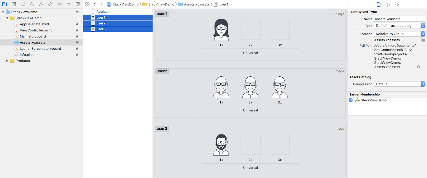
As you may notice, the sample app has three images. The question is how can you bundle images in Xcode projects?
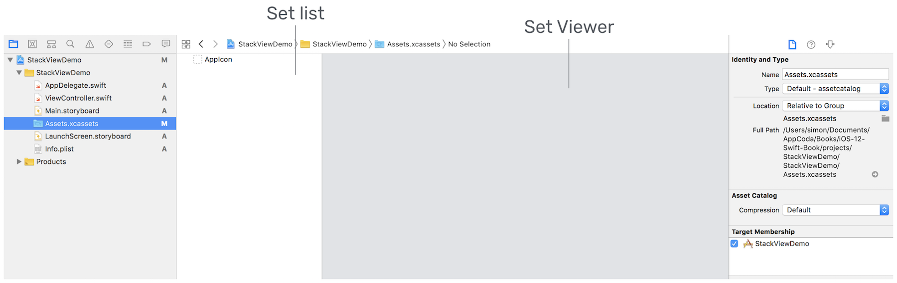
In each Xcode project, it includes an asset catalog (i.e. Assets.xcassets) for managing images and icons that are used by your app. Go to the project navigator and select the Assets.xcassets folder. By default, it is empty with a blank Appicon set. We are not going to talk about app icons in this chapter, but will revisit it after building a real-world app.
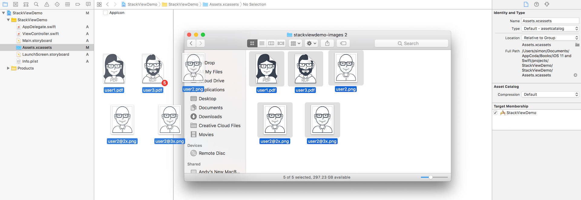
Now download this image set (https://www.appcoda.com/resources/swift4/stackviewdemo-images.zip) and unzip it on your Mac. The zipped archive contains a total of 5 image files:
- user1.pdf
- user2.png
- [email protected]
- [email protected]
- user3.pdf
Credit: The images are provided by usersinsights.com.
iOS supports two categories of images: raster images and vector images. Common image formats like PNG and JPEG are classified as raster images. Raster images use a grid of pixels to form a complete image. One problem of raster images is that it doesn't scale up well. Increasing the size of a raster image usually means a significant loss of quality. This is why Apple recommends developers to provide three different resolutions of images when PNG is used. In this example, the image files, prefixed by , comes with three versions. The one with @3x suffix, which has the highest resolution, is for iPhone 6/7/8 Plus and iPhone X. The one with @2x suffix is for iPhone SE/6/7/8, while the one without the @ suffix is for older devices with non-Retina display (e.g. iPad 2).
Vector images usually have file types such as PDF and SVG. You can use tools like Sketch and Pixelmator to create vector images. Unlike raster images, vector images are comprised of paths instead of pixels. This allows the images to scale up without losing any image quality. Because of this feature, you just need to provide a single version of the image in PDF format for Xcode.
I intentionally include both image types in the example for illustration purpose. When developing a real world app, you usually work with either one or the other. So which image type is more preferable? Whenever possible, ask your designer to prepare the images in PDF format. The overall file size is smaller and the images are scalable without losing quality.
To add the images to the asset catalog, all you need to do is drag the images from Finder, and drop them into the set list or set viewer.
Once you add the images to the asset catalog, the set view automatically organizes the images into different wells. Later, to use the image, you just need to use the set name of a particular image (e.g. user1). You can omit the file extension. Even if you have multiple versions of the same image (e.g. user2), you don't have to worry about which version (@2x/@3x) of the image to use. All these are handled by iOS accordingly.
Layout the Title Labels with Stack Views
Now that you've bundled the necessary images in the project, let's move onto the creation of stack views. First, open Main.storyboard. We'll start with the layout of these two labels.

Stack view can arrange multiple views (known as arranged views) in both vertical and horizontal layouts. So first, you have to decide whether you want to use a vertical or horizontal stack view. The title and subtitle labels are arranged vertically. Therefore, vertical stack view is a suitable choice.
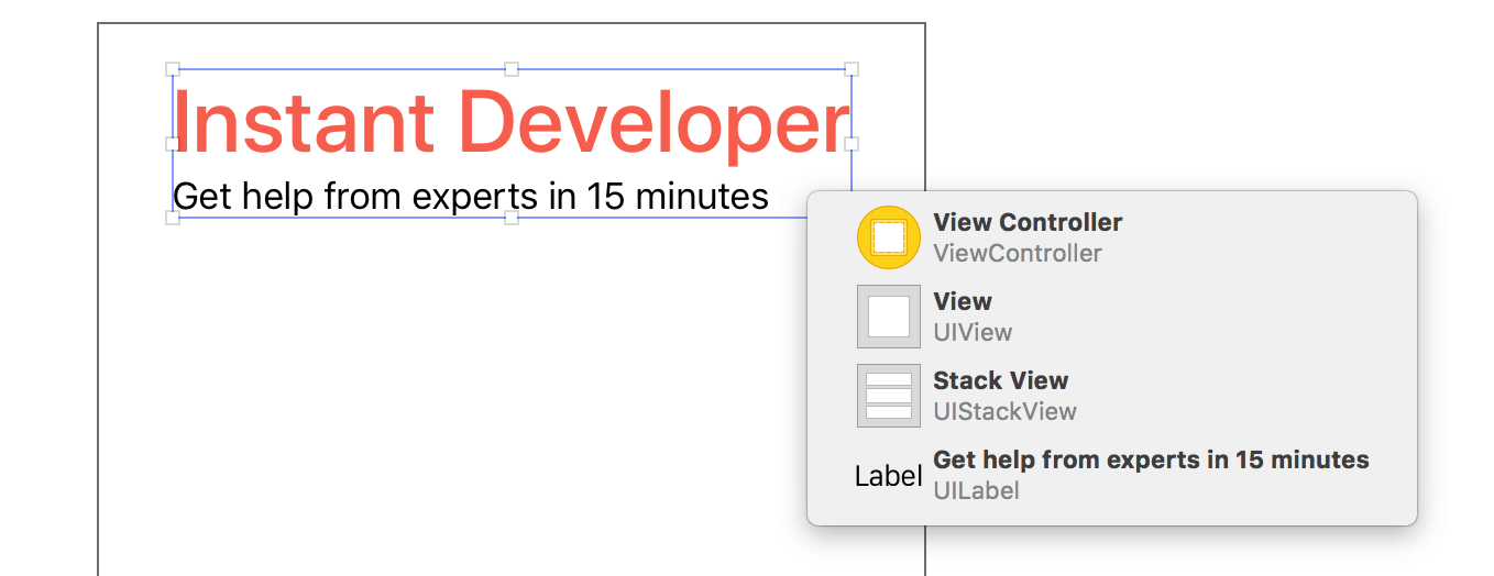
Click the Object library button to display the Object library. Drag a Vertical Stack View object to the view controller in the storyboard.
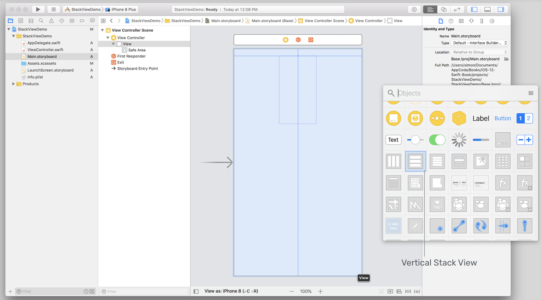
Next, drag a label from the Object library and put it right into the stack view. Once you drop the label into the stack view, the stack view automatically embeds it and resizes itself to fit the label. Double click the label and change the title to "Instant Developer". In the Attributes inspector, increase the font size to 40 points, and font style to medium. Optionally, you can change the color to red.
Now, drag another label from the Object library to the stack view. As soon as you release the label, the stack view embeds the new label and arranges the two labels vertically like this:
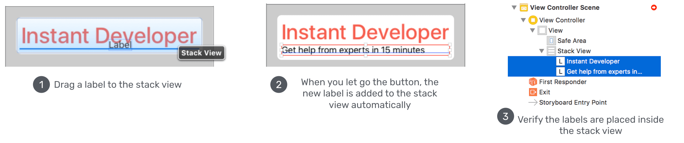
Edit the title of the new label and change it to "Get help from experts in 15 minutes". If you've done it correctly, the two labels should be placed inside the stack view. You can verify it by reviewing the objects in the document outline.
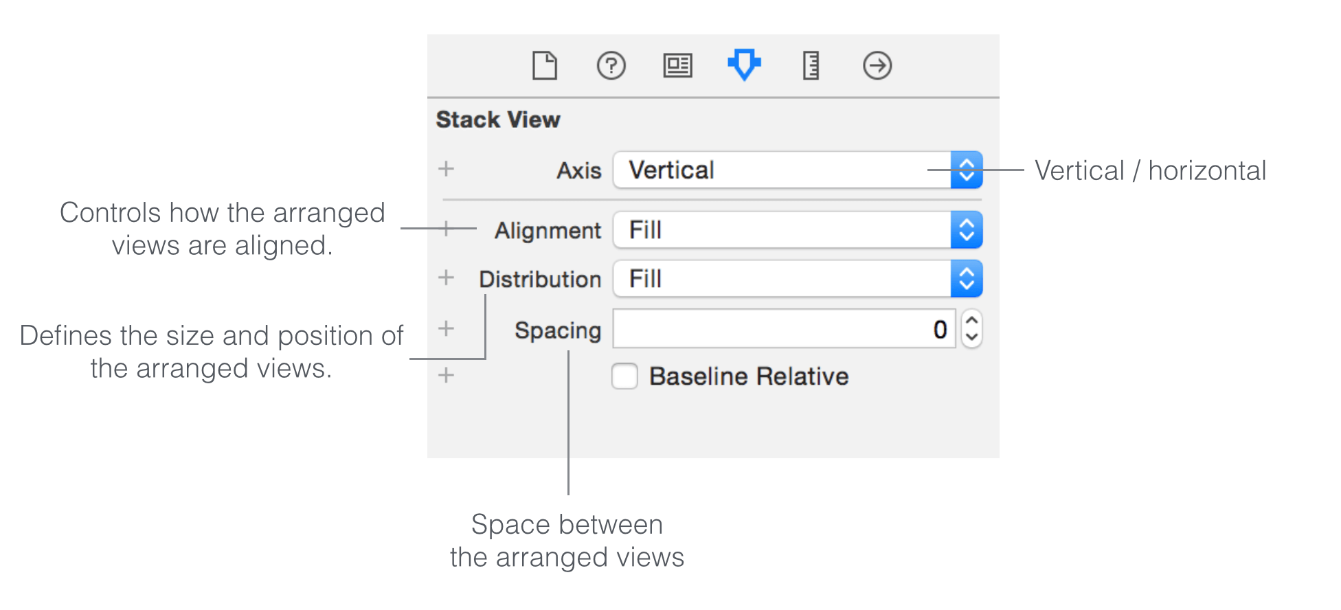
Currently, both labels are aligned to the left of the stack view. To change its alignment and appearance, you can modify the built-in properties of the stack view. Select the stack view and you can find its properties in the Attributes inspector.
As a side note, if you have any problems selecting the stack view, you can hold the shift key and right-click the stack view. Interface Builder will then show you a shortcut menu for selection. Alternatively, you can select the stack view in the document outline. Both approaches would work.
Let's briefly talk about each property of the stack view:
The axis option indicates whether the arranged views should be layout vertically or horizontally. By changing it from vertical to horizontal, you can turn the existing stack view to a horizontal stack view.
The alignment option controls how the arranged views are aligned. For example, if it is set to Leading, the stack view aligns the leading edge (i.e. left) of its arranged views along its leading edge.
The distribution option defines the size and position of the arranged views. By default, it is set to Fill. In this case, the stack view tries its best to fit all subview in its available space. If it is set to Fill Equally, the vertical stack view distributes both labels equally so that they are all the same size along the vertical axis.
Figure 6-11 shows some sample layouts of different properties.
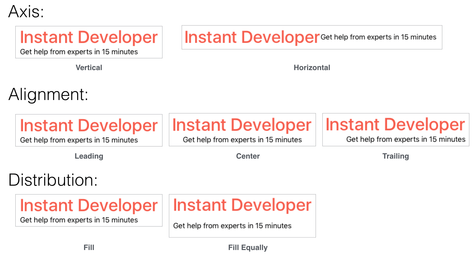
For our demo app, we just need to change the Alignment option from Fill to Center and keep other options intact. This should center both labels.
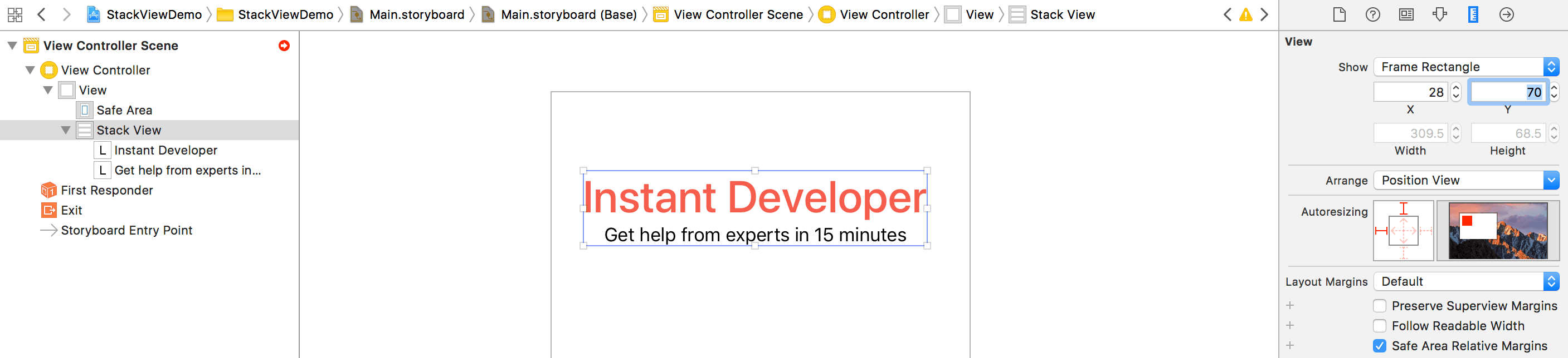
Before moving onto the next section, make sure you position the stack view correctly. This would help you easier to follow the rest of the materials. You can select the stack view and go to the Size inspector. Ensure you set the value of X to 28 and Y to 70.
Layout the Images Using the Stack Button
At the very beginning of this tutorial, I mentioned that there are two ways to use stack views. Earlier, you added a stack view from the object library. Now I'd like to show you another approach.
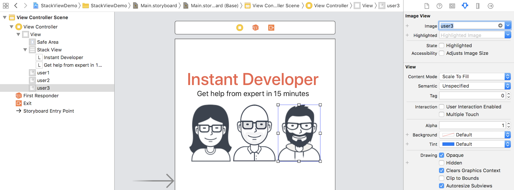
We're going to lay out the three user images. In iOS, we use image views to display images. From the Object library, look for the image view object, and drag it into the view. Once you added the image view, select the Attributes inspector. The image option already loads the available images from the asset catalog. Simply set it to user1. In the Size inspector, set the width of the image to 100 and height to 134.
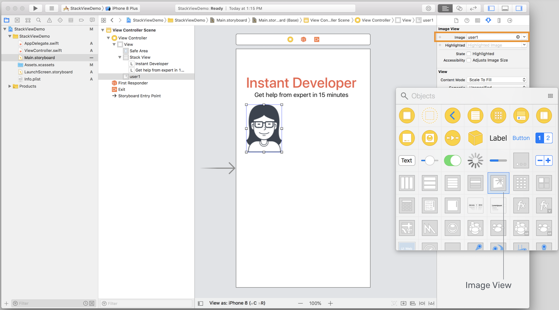
Repeat the procedures to add two more image views, and place them next to each other. Set the image of the second and third image view to user2 and user3 respectively. Your layout should look like this:
Using stack views minimizes the number of layout constraints you have to define, but it doesn't mean you do not need to define any auto layout constraints. For the image views, we want each of them to keep its aspect ratio. Later, the size of these images varies depending on the screen size. We want them to retain their aspect ratio, no matter they are stretched or squeezed.
To do that, in the document outline view, control-drag horizontally on the image view of user1. In the shortcut menu, select Aspect Ratio. Repeat the same procedure for the other two image views.
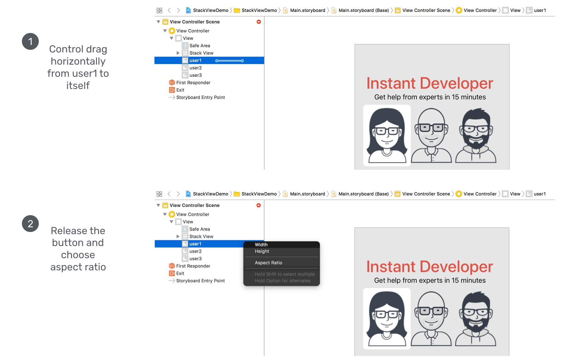
Now I want to group these three image views together using a stack view, so it is easier to manage. However, we will use an alternative approach to create the stack view.
Hold the command key and click the three image view to select them. Then click the Embed in button in the layout bar and choose Stack View. Interface Builder automatically embeds the image views in a horizontal stack view.
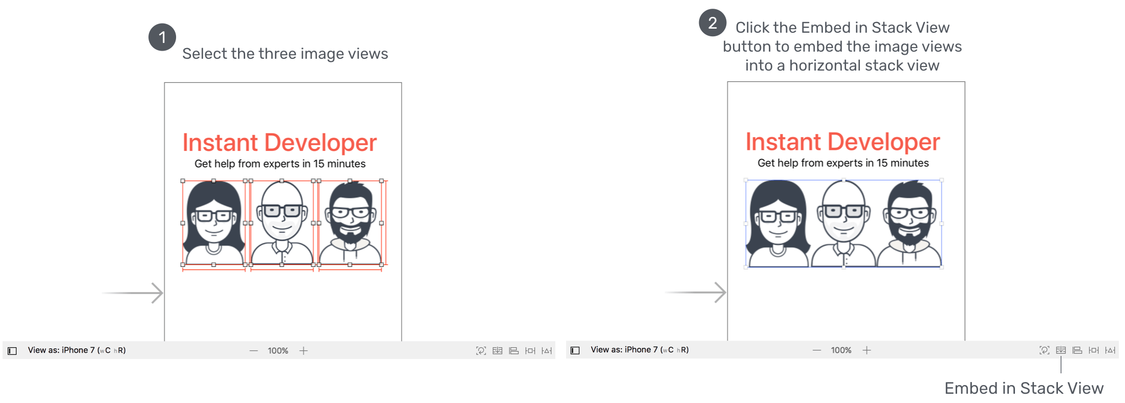
To add some spacing between the image views, select the stack view and set the spacing to 20. Also, change the Distribution option from Fill to Fill Equally.
Quick note: It seems that the stack view has already distributed the image views equally. Why do we need to change the distribution to Fill Equally? Remember that you're now designing the UI for all screen sizes. If you do not explicitly set the distribution to Fill Equally, iOS will layout the image views using Fill distribution policy. It may not look good on other screen sizes.
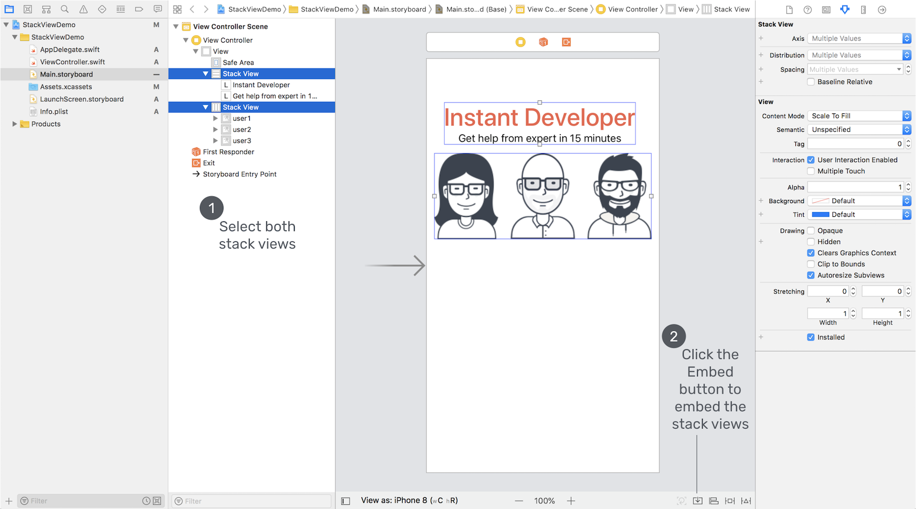
Now you have two stack views: one for the labels, and the other for the image views. These two stack views can actually be combined together for easier management. One great thing about stack views is that you can nest multiple stack views together.
To do that, select both stack views in the document outline view. Then click the Embed in > Stack View to embed both stack views in a vertical stack view. After that, make sure that the alignment of the new stack view is set to Fill. This size of the stack view increases as the screen size grows. By setting the alignment property to Fill, this ensures the image views are resized automatically on larger screens. You will understand what I mean when we preview the UI on iPad.
Cool, right? So far the UI looks good on iPhone 8. But if you preview the UI on other devices, it doesn't look as expected. The reason is that we haven't defined the layout constraints for the stack views.
Adding Layout Constraints for the Stack View
For the stack view, we will define the following layout constraints:
- Set a spacing constraint between itself and the top layout guide, such that it is 50 points away from the top anchor of the safe area layout guide.
- Set a spacing constraint between the left side of the stack view and the leading anchor of the safe area, such that there is a space of 10 points between them.
- Set a spacing constraint between the right side of the stack view and the trailing anchor of the safe area, such that there is a space of 10 points between them.
To continue reading and access the full version of the book, please get the full copy here. You will also be able to access the full source code of the project.