Great apps have great user interfaces, and chances to build a great interface entirely inside the views of the view controllers in the storyboard file(s) are small. Usually, complex views are being designed in separate Xib (Interface Builder) files, and knowing how to load content from custom views is a mandatory skill that each macOS developer must have. This kind of separation also helps in maintenance, extendibility and testing of the app. In the previous macOS tutorial, we didn’t create any custom views as the focus was on other topics, but now it’s about time to discuss about that.
The solution we will implement today so we can load custom views is going to be reusable code that can apply to any macOS project. That means that by leaving today you’ll get a small tool that will automate and speed up your work when building your own apps.
Besides that, in this tutorial we are going to walk through some common Cocoa controls that are met on macOS, and we’ll talk about their properties, how they can be configured, and how we can get or set values to them both graphically and in code. I bet that you’ll find a few interesting things among them.
Without any additional delay, let’s get started by having a look at our demo app.
The Demo App
Unlike to previous tutorials, the demo app we are going to build today won’t be functional. Instead, it will just present the user interface which will be designed in custom views. To be more precise, we are going to build an app that in a hypothetical scenario can be used by a tech job seeker (i.e. developer, designer) to provide some personal information and some work-related information. We are going to present two different views for that purpose:
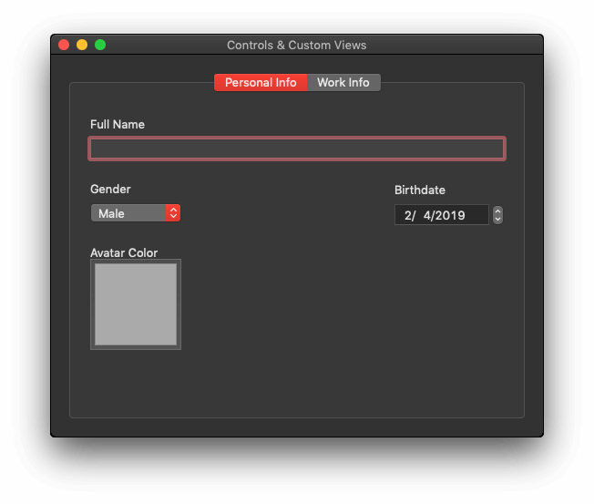
And:
The above two views are custom views that they will be eventually loaded and shown into a tab view (a control with tabs as you can see in the images above). What is interesting here is the variety of controls (Cocoa controls) that they are contained overall in both views, and we’ll talk about them in the following parts. In summary we’ll meet the following:
- Label
- Text field
- Popup button
- Date picker
- Color well
- Combo box
- Radio buttons
- Box
- Sliders
- Check box
- Segmented control
- Level indicator
- Tab view
As there are a lot of things to discuss today we won’t start from scratch, so please download this starter project to work with. Open it and familiarize yourself a bit with it. You will find a group called “Custom Views” with four files: PersonalInfoView.swift, PersonalInfoView.xib, WorkInfoView.swift, and WorkInfoView.xib. These will contain the design and implementation of the custom views. Some code, as well as some UI parts in the Xib files already exist. The .swift files implement both a method named applyConstraints(). The purpose is to set the layout constraints programmatically, so you don’t have to apply constraints manually while we’ll be adding Cocoa controls to the views. That would be a waste of time too. However, whenever I’ll be presenting a new control, I’ll also give you the frame that you should set so it has a position and size in Interface Builder. You should use the Size Inspector in Interface Builder to set the frame values.
So, let’s get started!
Adding Cocoa Controls To The First Custom View
We’ll start discussing about Cocoa controls by adding some of them to the PersonalInfoView.xib file, so open it by clicking on it in the Project Navigator. The view you will find here is already resized to 450×350 px.
Most probably you know that already, but the way to add a Cocoa control into a view is to:
- Show the Objects Library.
- Select or search for the control you want to add.
- Drag it onto the view.
As a reminder, there is no need to add layout constraints for the controls we’ll be using in the following steps. I provide them to you programmatically, and the only thing needed is to apply them. But that’s for later. So, now, let’s go through some Cocoa controls:
Label
A label is one of the most common Cocoa controls used to macOS apps, and its purpose is to display text that users cannot edit while the app is running. On the contrary of what one would expect, a label control is not a NSLabel object (in accordance to the UILabel in iOS). Actually, there’s not such a class (NSLabel). Instead, a label is a NSTextField object (yes, a text field), which is not editable and has no borders and background color.
From the Objects Library add a label to the view. Notice that there are two kind of labels while Objects Library is visible: Single and multi line. Add a single one here, but keep multi line in mind as it can wrap multiple lines when there is long text to display.
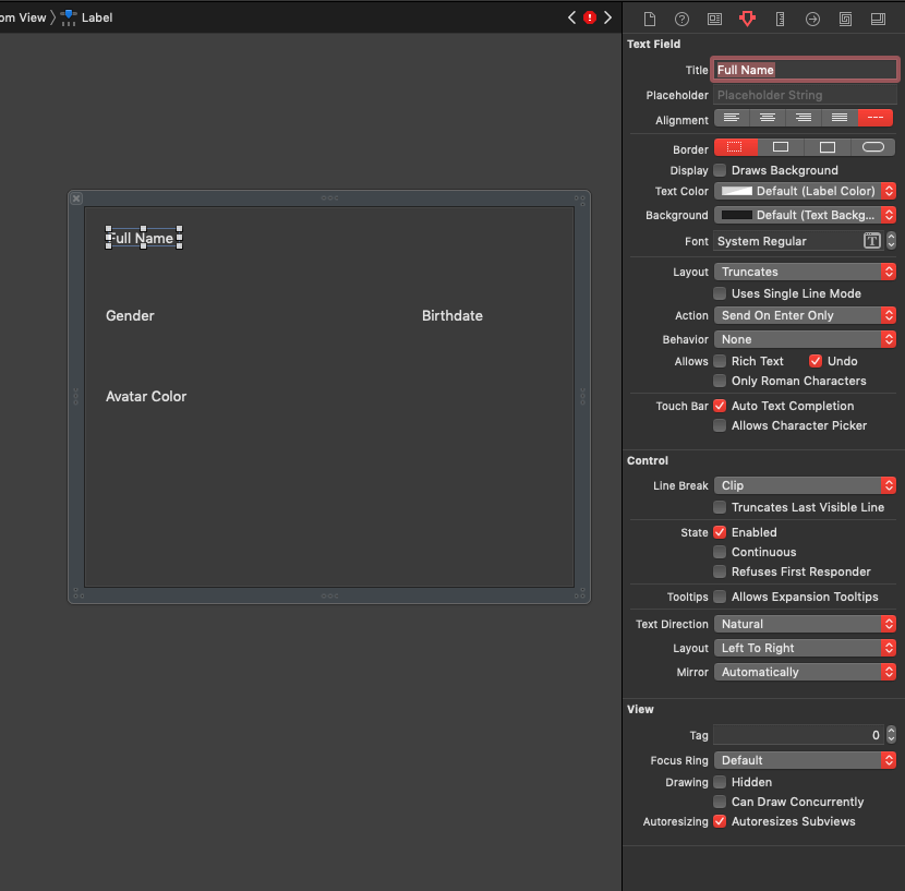
Through the Sizes Inspector set the label’s frame to: 20, 313, 70, 17. Then, in the Attributes Inspector set its Title to “Full Name” (without the quotes). In the Attributes Inspector you can find various properties you can change, so the default look of the label is changed. For example, you can change the font family, size or weight, the text color, alignment, borders, and so on. Feel free to go through those properties and see how the label is affected.
Text Field
With the first label being in place, the second quite common Cocoa control used in macOS apps is the text field. It’s a NSTextField object, and its purpose is to enable apps receiving user input when necessary. A text field is a single-line text input control, so if you want multiple lines of text you’d better pick a text view instead.
From the Objects Library add a text field to the view, and set its frame to: 20, 283, 410, 22. As both label and text field are objects of the same class (NSTextField), the properties you will find in the Attributes Inspector are the same. A text field though is by default editable, it has a border and draws its background. Compare the properties between the two, and try to change some text field properties to see what happens.
In code, setting the value of the text field is done as follows:
|
1 |
textField.stringValue = "Hello World!" |
You can also assign numerical values directly to text fields:
|
1 2 |
textField.intValue = 5 anotherTextField.doubleValue = 22.45 |
The properties shown above are also used to get the value of a textfield, for example:
|
1 |
print(textField.stringValue) |
To control the editing behaviour, the class that implements the text field should conform to the NSTextFieldDelegate protocol and be set as the text field’s delegate. Find more about it here.
Popup Button
A popup button displays a list of predefined options as a popup. It’s a NSPopUpButton object which inherits from the NSButton class, therefore it brings along button’s properties. By default, three items are contained when adding a popup button to a view, where an item is actually a menu item (NSMenuItem), another Cocoa control. If the popup items are known in advance you can specify them in Interface Builder. Otherwise, if they are created on the fly while the app is running, setting them through code is the only way.
Let’s be practical, so open the Objects Library to add a popup button to the view (frame: 21, 213, 100, 25). To rename the default items you have the following options:
- Double click on the popup control, and then double click on each item or use the Attributes Inspector to change the title.
- Use the Document Outline as shown next to access the menu items, select them one by one and go to Attributes Inspector to rename.
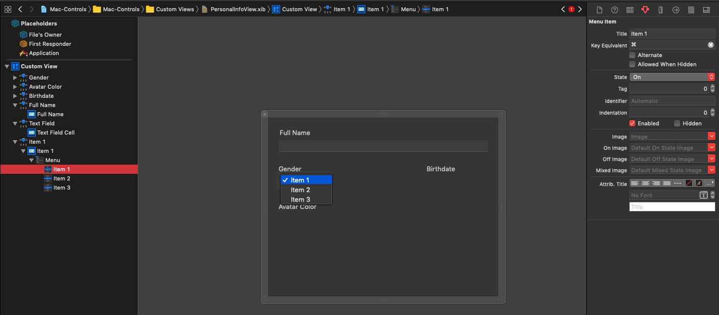
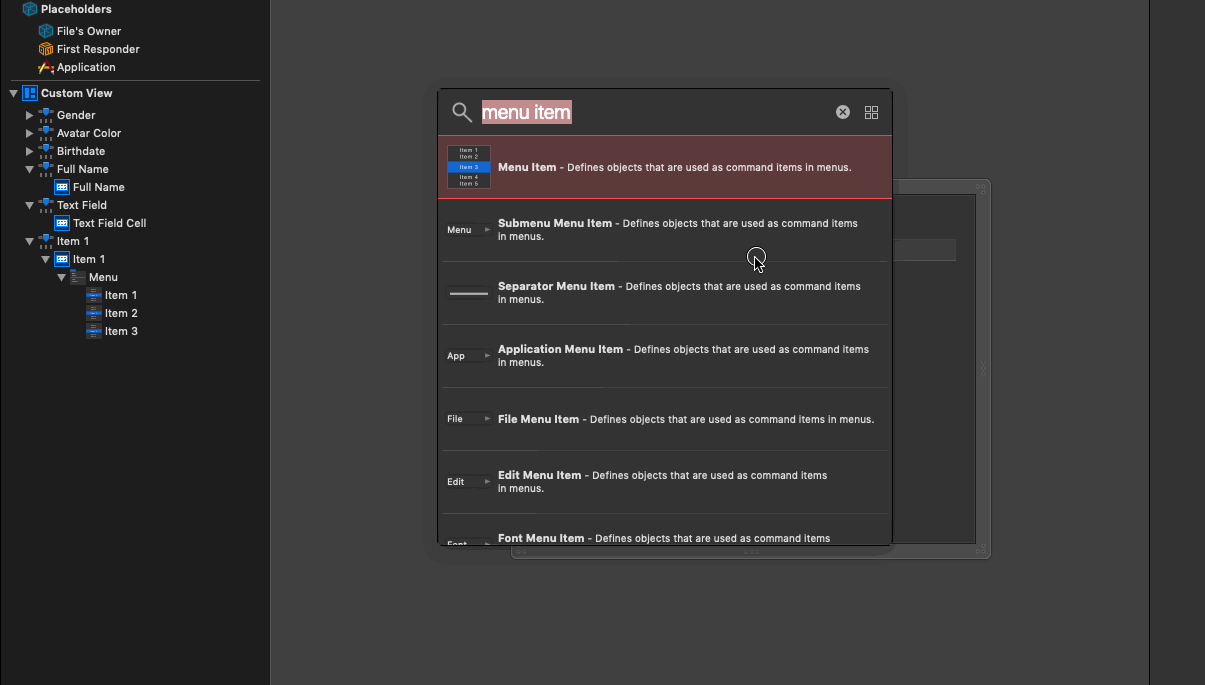
To add more items to the popup simply open the Objects Library, search for “Menu Item” objects, and drag to the Document Outline above or below the existing items as needed. You can even add separators, a special menu item that displays a horizontal separator line that allows to separate menu items graphically.
To append items programmatically is easy:
|
1 |
popup.addItems(withTitles: ["One", "Two", "Three"]) |
To append a single item in addition to the existing one:
|
1 |
popup.addItem(withTitle: "Four") |
Note that the above two methods append new items without removing any existing items in the popup, so make sure that you remove any existing items if necessary (if you haven’t done so in Interface Builder):
|
1 |
popup.removeAllItems() |
You can also remove items at specific index:
|
1 |
popup.removeItem(at: 0) |
In a similar fashion you can get the title of an item at a specific index:
|
1 |
popup.itemTitle(at: 0) |
You can get an array of titles too:
|
1 |
popup.itemTitles |
Note that itemTitles is a property, not a method. Most times you’ll want to get the title of the selected item, or the index of the selected item:
|
1 2 3 4 5 |
// Selected item title popup.selectedItem // Index of selected item popup.indexOfSelectedItem |
Lastly, it’s quite common to select items programmatically. The next two lines do that using both the index of an item, and its title:
|
1 2 |
popup.selectItem(at: 0) popup.selectItem(withTitle: "Three") |
The above simple methods and properties are good enough to let you deal with popups. As a note, always make sure that the index value is not our of range when you use indices to access items.
Back to Interface Builder again, in the Attributes Inspector you’ll find properties specific to popup button, as well as to the NSButton in general. An interesting property is the Type in the Pop Up Button section.
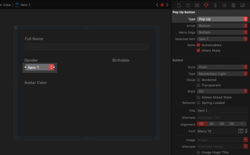
By default, Pop Up is the selected value and the control works as a… popup. However, if you change that to Pull Down, then the control will act as a dropdown menu.
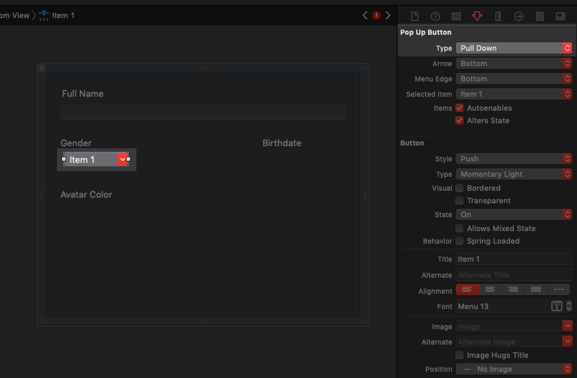
In the same section you can also choose whether the arrow will be displayed in the popup, what the default selected item is going to be, and more. In most cases, leaving the rest of the properties in their initial value is fine, but that’s always up to you.
For our demo app here, set the following values to the popup: “Male”, “Female”, “Other” (without the quotes of course!).
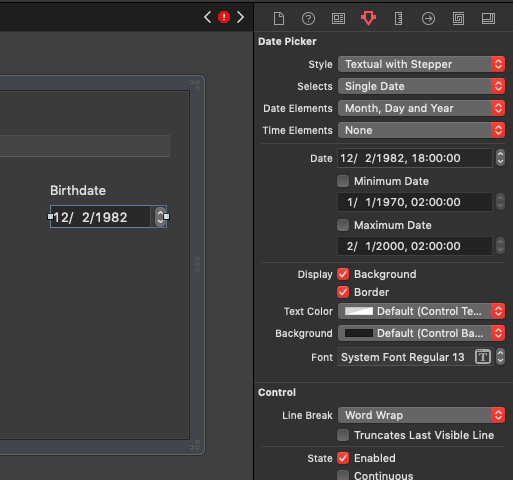
Date Picker
It’s necessary sometimes to let user set or pick a single date (with or without time), or select a date range through the app’s interface. And even though creating such a custom control sounds like a bit of hard work, Cocoa offers a built-in date picker which can be configured pretty easily.
In the Objects Library search for a “Date Picker” object and drag it to the view (frame: 310, 212, 120, 27). Date picker control provides the following display styles:
- Textual representation of the date, with or without a stepper to the right side:
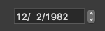
- Graphical representation, which allows to select date ranges as well:
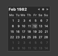
Date picker’s style can be set in the Style field under the Date Picker section in the Attributes Inspector. Additional important options can be specified there as well, such as whether time will be displayed along with the date, whether a single date or a date range is allowed to be selected by users, whether date elements (such as day, month, year) should be displayed or not (in case you want to show time only), and more. You can also set the default date displayed to the picker, as well as to limit the minimum and maximum date value. At the end, the configuration of the date picker is totally dependent on the app, and whether you’ll choose the one or another style has to do with the UX and the rest of the UI the app provides.
In case you want to have the date picker display the current date each time the app is running, then you have to do that programmatically:
|
1 |
datePicker.dateValue = Date() |
The value of a date picker is a Date object, that’s why we instantiated such an object above. Use the dateValue property shown above to also “read” (get) the picker’s value and do whatever is needed to do with it (some knowledge on how to deal with Date objects is required).
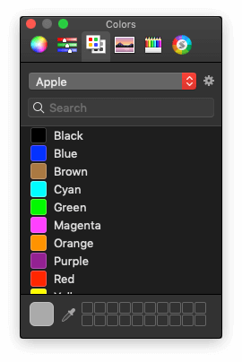
Color Well
Cocoa provides a nice control to let users access the Colors system panel and pick a color to use in the app. This control is called Color Well and it can be found in the Objects Library along with the rest of controls. Go and add such a control to the view (using frame 20, 60, 100, 100), and then open the Attributes Inspector. You will see that there are no many properties to configure, with the most important being the default shown color to the well.
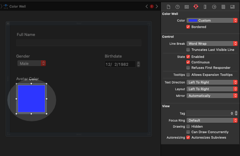
Programmatically, you can set and get the color well’s color through its color property:
|
1 |
colorWell.color = NSColor.lightGray |
This control triggers the appearance of the Colors panel, which is familiar to macOS users, and therefore will make them feel more comfortable with your app too.
Final Actions On The Personal Info View
The first round of the Cocoa controls presentation is finished. Before we move on to the second custom view where we’ll meet more controls, it’s necessary to perform some final actions here so it’s possible for the UI to be correctly displayed when we’ll run the app.
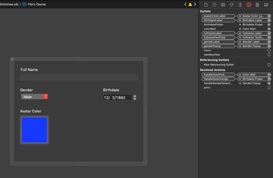
In the Document Outline select the File’s Owner object and open the Identity Inspector. Set the PersonalInfoView value to the Class field.
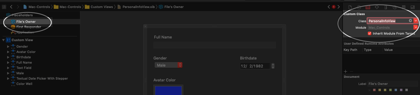
With the File’s Owner object still selected, open the Connections inspector. You will find there IBOutlet properties for all controls added to the view. Connect each property to the respective control (use their names to do the matching, names are self-descriptive), so layout constraints can be applied programmatically. For example, connect the fullnameTextfield IBOutlet to the text field in the view, the colorWell to the color well, the birthdatePicker to the date picker, and so on.
Also, connect the following actions (IBAction methods) to the proper controls as described:
handleColorPick:to the color well.handleDateChange:to the date picker.handleGenderSelection:to the gender popup button.
Adding Cocoa Controls To The Second Custom View
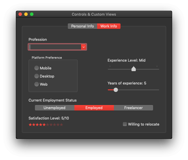
Now that we’ve created our first custom view called PersonalInfoView, let’s move ahead to design the next one, named WorkInfoView. In this part we’ll continue the presentation on the most important Cocoa controls one can use while building macOS apps.
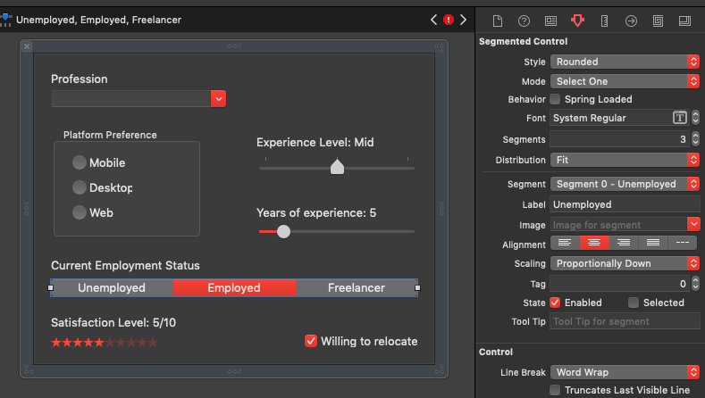
The WorkInfoView is supposed to present a form that a potential job seeker could use to provide work and experience related information. No real logic will be applied, but what we are going to do is perfect for training and learning purposes. By the end of this part we’ll have built a view that will look like this one:
Open the WorkInfoView.xib file and let’s keep talking about Cocoa controls.
Combo Box
A combo box looks quite similar to dropdown button (see the popup button previously) at first glance, as it’s another control that can list items. However there are significant differences, with the first and most important one being the fact that users can type text in the combo box, exactly as they would do in a text field. In other words, a combo box combines the features of a dropdown button and a text field. Users can select a value from the listed items, or type a new one.
Another difference is that the combo box items are not menu items. To see how items can be added to (or removed from) the combo box in Interface Builder, open the Objects Library and drag a Combo Box object to the view (frame 20, 285, 200, 26). Select it and then go to the Attributes Inspector. There is a field called Items where you can add new items, and rename or remove existing ones. You can also specify the number of visible items when the combo box is expanded.
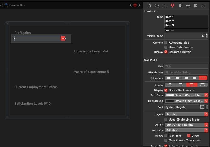
Besides that, text field related attributes can be also set so the combo box can be configured as a text field would be configured too. Change various properties and change the number of items to see how everything is reflected on the combo box. At the end, you can add the following two items:
- Developer
- Designer
In code level, use the following method to add objects programmatically to the combo box:
|
1 |
comboBox.addItem(withObjectValue: "A single item") |
The type of the parameter in the above method is Any which means that you can pass any kind of value you want. It is also possible to pass an array of Any objects using the following:
|
1 |
comboBox.addItems(withObjectValues: ["Hello", 123, true]) |
Notice that the array contains a string value, and integer and a boolean. All of them will be displayed to the combo box.
Getting values is easy too; here’s how to get the value of the selected item:
|
1 |
comboBox.objectValueOfSelectedItem |
Getting the value at a specific index:
|
1 |
professionCombo.itemObjectValue(at: 2) |
Finally, use the property shown below to get an array of all items in the combo box:
|
1 |
professionCombo.objectValues |
Regarding the text field “personality” of the combo box, whatever you read about text fields applies here too. For example, you can use the stringValue property to get or set its string value.
Box
A box control is useful to group together other controls which usually regard a common functionality or concept. A box can have a custom title or not, and the title can exist at the top or bottom. If you don’t want your users to know that there is a box control that groups together other controls, you can make it transparent and they won’t see anything. Everything is a matter of setting the proper properties.
To see all that, drag a Box object from the Objects Library in the view, and set its frame to 20, 140, 170, 125. In the Attributes Inspector you can see the few properties that can be set for the box control. For our demo here, set the title value to “Platform Preference”.
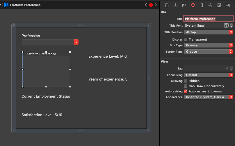
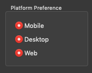
Radio Button
Radio buttons are useful in an app for letting users select a distinct value among several which are conceptually grouped together. When using radio buttons, no multiple selection of values from the same group of radio buttons is possible. Also, a single radio button is meaningless (if you believe you need a single radio button, then you actually need a… check box. See later in this part). Note that a radio button control is actually a NSButton object.
Open the Objects Library and add three radio buttons to the box you added right before (make the radio buttons subviews of the box’s view). Select them one by one and set the following frames:
- 20, 76, 70, 16
- 20, 48, 70, 16
- 20, 20, 70, 16
Next, go to the Attributes Inspector to see their configurable properties. Most of the times, you won’t need to change anything except for the title, state (on or off), and probably font attributes. For our demo, set the following titles:
- Mobile
- Desktop
- Web
If you could run the app now to see the radio buttons working, you would end up to an unpleasant result; all radio buttons could be turned on, and they wouldn’t mutually turn off the others when one is selected.
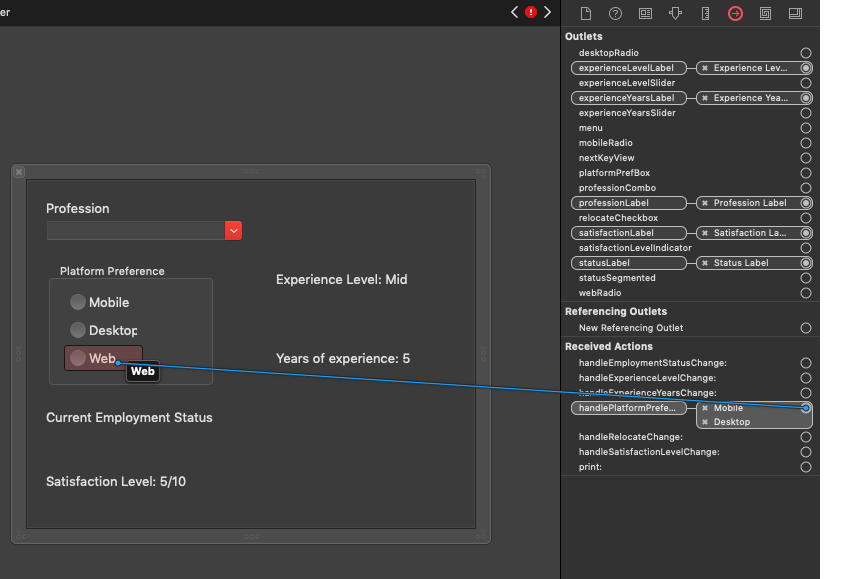
And the question that arises here is how can we group them together so they actually work as expected? The answer is to connect them all to the same IBAction method.
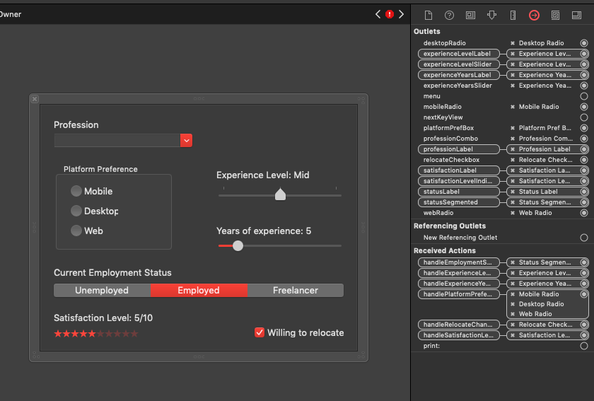
To do so here, select the File’s Owner object in the Document Outline view, and in the Identity Inspector set the WorkInfoView as the value for the Class field. Then open the Connections Inspector, and you will find various actions waiting to be connected to controls in Interface Builder. Select the handlePlatformPreference: and connect it to all three radio buttons.
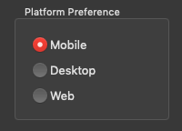
Doing so makes them work properly:
To get or set the state of a radio button programmatically, use the state property:
|
1 |
radioButton.state |
In most cases, simply identifying the clicked radio button in the connected IBAction method is enough to let you continue with the app’s logic. You’ll need the radio button’s value if only its title has some meaning. Use the title property to get it.
Check Box
Check box is another special kind of a button (NSButton). Unlike to radio buttons, multiple check boxes do not mutually disable each other, and even a single check box is meaningful. For example, a check box could be used to let users indicate whether they’d like to enable a setting that would allow auto-saving of their work to the disk. Think of a check box as the graphical equivalent of a boolean value (true or false).
A check box is quite similar to the radio button regarding the available properties. Open the Objects Library and add a Check Box Button to the view (frame 303, 20, 130, 14). Then open the Attributes Inspector to see the available properties. You will notice that you can set the initial state for the check box, title, and everything else that can be also set to a radio button. Change the title of the check box you just added to “Willing to relocate”.
Slider
A slider control (NSSlider object) allows users to slide left or right a virtual knob on a bar, and move therefore among a range of values. Usually, all it takes to set up a slider is to specify the minimum and maximum values that define the range of values it represents, as well as the initial current value. However, a slider can optionally display tick marks (you’ll see what that is right next), it can be vertical or to be presented in a totally different way; as a circular slider instead of linear, something that’s useful under specific cases. Regardless of the visual style, whatever will be presented here remains the same.
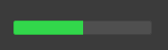
To see sliders in action, grab one from the Objects Library (search for a Horizontal Slider object) and add it to the view (frame 250, 212, 180, 19). By default, a horizontal slider looks like this one:
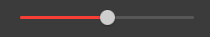
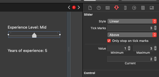
To change this appearance and let the slider show tick marks, go to the Attributes Inspector and change the number of the marks in the Tick Marks field from 0 to 3. The slider will instantly change form. Additional options can be configured from there on, such as whether the tick marks should be placed above or below the slider, or whether the knob should stop on tick marks only or not. For the favor of our demo, enable the Only stop on tick marks check box.
Right below you set the minimum, maximum and initial current value of the slider. Set 1 as the minimum, 3 as the maximum, and 2 as the current one. In this fake demo app, these values stand for the experience level of a professional: Junior, mid, senior. When the slider changes value, the label above it will be updated to reflect the proper experience level.
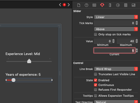
To make this example even more complete, add one more horizonal slider to the view from the Objects Library (frame 250, 140, 180, 19). This one will represent the years of experience of a professional developer, designer, or anything else set in the combo box. This time let’s keep it without tick marks. Set 0, 40, 5 as the values for the minimum, maximum and current fields respectively. Lastly, enable the Continuous check box in the Control section. By doing so you make the slider capable of reporting its value to the app while the knob is being moved. When that check box is off, slider reports its value after the knob has stopped moving. You’ll see the difference when you will run the app since we have two sliders with different settings.
Programmatically speaking, you can get or set the slider’s current value using the intValue property:
|
1 |
slider.intValue |
Minimum and maximum values can be also set programmatically using the minValue and maxValue specifically. Both properties expect for a Double value.
To see how we can update the labels above each slider with the slider’s value, select the File’s Owner in the Document Outline and open the Connections Inspector. Connect the handleExperienceLevelChange: action to the first slider with the tick marks, and the handleExperienceYearsChange: to the second slider that represents the years of experience. Then switch to the WorkInfoView.swift file and go to the handleExperienceLevelChange(_:) IBAction method. Add the following code:
|
1 2 3 4 5 6 7 8 |
@IBAction func handleExperienceLevelChange(_ sender: Any) { switch experienceLevelSlider.intValue { case 1: experienceLevelLabel.stringValue = "Experience Level: Junior" case 2: experienceLevelLabel.stringValue = "Experience Level: Mid" case 3: experienceLevelLabel.stringValue = "Experience Level: Senior" default: () } } |
The code above updates the label’s text based on the hypothetical experience level specified in the slider. Doing something similar for the years of experience, go to handleExperienceYearsChange(_:) IBAction method and add the following:
|
1 2 3 |
@IBAction func handleExperienceYearsChange(_ sender: Any) { experienceYearsLabel.stringValue = "Years of Experience: \(experienceYearsSlider.intValue)" } |
Since the Continuous property was enabled for the second slider, the code above will be executed every time the knob is being moved left or right updating the label in real time. The previous IBAction method on the contrary will be called only after the knob is stopped.
Level Indicator
Another Cocoa control that behaves similarly to slider but has different appearance and different kind of settings, is the level indicator. Even though this is not such a common control that one can find in the majority of macOS apps, I include it here because you might find it useful at some point.
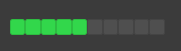
Level indicator supports four different appearances which makes it perfect for several kinds of apps. The default one is the Discrete Capacity:
There is also the Continuous Capacity:
The Relevancy:
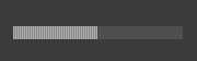
And finally Rating:
A level indicator can be editable or not. When it’s editable, users can set the level in a fashion similar to slider’s (slide the level left or right). Also, similarly to sliders again, a minimum, maximum and initial current value must be set here too. You can have tick marks, but I just don’t find them looking good in a level indicator. What is really nice in this control is that you can apply different colors for the normal, warning and critical level when using either the Discrete Capacity or Continuous Capacity style. In that case, you must also provide the values for the warning and critical levels (additional fields appear in the Attributes Inspector).
So, back to the WorkInfoView.xib file, let’s add a level indicator control to our view (frame 20, 20, 150, 12), and let’s set its style to Rating. This style will display stars that represent the satisfaction level regarding the job of the person who’s using this form in our hypothetical scenario. Set 0, 10, 5 as the minimum, maximum and current value respectively. Also, change the color to red by opening the Image Color popup (any red color would be fine). Note that instead of using the default stars, we could have provided our own set of images (two images are required, one for the selected and one for the non-selected state that would go into the Rating and Rating Placeholder fields accordingly). Also, enable the Continuous and Editable check boxes.
Now, open the Connections Inspector after you select the File’s Owner object in the Document Outline, and connect the handleSatisfactionLevelChange: action to the level indicator control. Switch to WorkInfoView.swift file and go to the handleSatisfactionLevelChange(_:) IBAction method to add this:
|
1 2 3 |
@IBAction func handleSatisfactionLevelChange(_ sender: Any) { satisfactionLabel.stringValue = "Satisfaction Level: \(satisfactionLevelIndicator.intValue)/\(Int(satisfactionLevelIndicator.maxValue))" } |
As you can see, the way to get the level value (intValue) property is similar to getting a slider’s value. The above also gets the maximum value set to the indicator so the satisfactionLabel can display something like: “Satisfaction Level: 8/10”.
Segmented Control
A segmented control is actually a button separated in multiple segments, and it provides a way to select single or multiple values among a collection of values grouped together. You can have as many segments as necessary, with the default number being 3. A segment can be identified using a label, an image, or a combination of these two. Other properties regarding the style and the selection mode are also available in the Attributes Inspector.
To see a segmented control in action, return to the WorkInfoView.xib file and add one from the Objects Library to the view, right below the “Current Employment Status” label. Set its frame to 18, 74, 414, 24, and while you are at the Size Inspector, select one by one the segments on the top and change the fixed width to 136. Then, set “Unemployed”, “Employed” and “Freelancer” to each segment label respectively.
Using the segmented control in code is easy. To show that, select the File’s Owner and open the Connections Inspector. Connect the handleEmploymentStatusChange: action to the segmented control. Then open the WorkInfoView.swift file and in the handleEmploymentStatusChange(_:) IBAction method add the following two lines:
|
1 2 3 4 |
@IBAction func handleEmploymentStatusChange(_ sender: Any) { let selectedSegment = statusSegmented.selectedSegment print(statusSegmented.label(forSegment: selectedSegment)) } |
The above will print to the console the label of the selected segment.
Finishing Actions
The second round of exploring Cocoa controls is finished, but there is one last step required so this view shows up properly when we will load it. In the WorkInfoView.xib file, open the Connections Inspector after you select the File’s Owner object in the Document Outline, and connect all Outlet properties to the proper controls. Naming of the outlets is self-descriptive, so you won’t have any problem at matching them properly.
Preparing To Load Custom Views
Having gone through the most of the important Cocoa controls, it’s about time to become a bit more practical and see how we can load the custom views we created in the previous parts. What we are going to do here is not meant to be a one-time solution that will work in the demo app of this tutorial only. Instead, we’ll create reusable code that can be used to load any custom view in the future, in any app.
In the previous parts, we set the proper custom view class to the File’s Owner object on each Xib. In the PersonalInfoView.xib file we set the PersonalInfoView class as the File’s Owner, and the WorkInfoView to the WorkInfoView.xib file. However, none of the two custom view classes will load the Xib contents automatically and the IBOutlet properties will remain nil. Loading from a Xib file (or a Nib as it’s also called) is a custom job that developers have to do.
As our aim is to write reusable code and provide a solution as much general as possible, we’ll create a protocol along with a protocol extension that will contain default implementation of the methods that we’ll define. Open the LoadableView.swift file, and add the following:
|
1 2 3 4 5 |
protocol LoadableView: class { var mainView: NSView? { get set } func load(fromNIBNamed nibName: String) -> Bool func add(toView parentView: NSView) } |
Any NSView subclass that will adopt that protocol will be capable of loading a custom view from a Xib file explicitly set, and a strong reference to that custom view will be kept through the mainView property. The load(fromNIBNamed:) method is the one which will do the actual work here.
Let’s continue now by implementing an extension for our protocol:
|
1 2 3 |
extension LoadableView where Self: NSView { } |
Notice that the default implementation that we’ll provide here will work if only the class that adopts the protocol is a NSView class. Using the where Self: NSView clause is important, as the implementation you will see right next needs to know the type of self (the object that conforms to the protocol) and it has to be a NSView object.
Let’s start implementing the first method:
|
1 2 3 4 5 6 7 8 9 10 11 12 13 |
extension LoadableView where Self: NSView { func load(fromNIBNamed nibName: String) -> Bool { var nibObjects: NSArray? let nibName = NSNib.Name(stringLiteral: nibName) if Bundle.main.loadNibNamed(nibName, owner: self, topLevelObjects: &nibObjects) { guard let nibObjects = nibObjects else { return false } } return false } } |
The most important line in the above code is the one where the loadNibNamed(_:owner:topLevelObjects:) method of the Bundle class is called. That one opens the given Nib (Xib) file, and appends any top-level views (views in the IB canvas, not subviews inside a view) to the nibObjects array. If you wonder why nibObjects is a NSArray instead of a Swift [Any] array, that’s because that method expects for a NSArray instance.
Another thing to notice is the return value of the method. If the Nib file cannot be opened (for example, you mistype the Xib’s file name), or the nibObjects array remains nil even after opening the Nib (eg, no views exist), we return false to indicate that no custom view was loaded.
Let’s get going with the implementation:
|
1 2 3 4 5 6 7 8 9 10 11 12 13 14 15 |
let viewObjects = nibObjects.filter { $0 is NSView } if viewObjects.count > 0 { guard let view = viewObjects[0] as? NSView else { return false } mainView = view self.addSubview(mainView!) mainView?.translatesAutoresizingMaskIntoConstraints = false mainView?.leadingAnchor.constraint(equalTo: self.leadingAnchor).isActive = true mainView?.trailingAnchor.constraint(equalTo: self.trailingAnchor).isActive = true mainView?.topAnchor.constraint(equalTo: self.topAnchor).isActive = true mainView?.bottomAnchor.constraint(equalTo: self.bottomAnchor).isActive = true return true } |
Our next step as shown above is to filter the objects returned and keep the NSView instances only. Note that a Xib file might contain other Cocoa controls in the canvas that are not NSView objects. For instance, we could have a copy of a button (NSButton) control somewhere in the canvas, which would be contained in the nibObjects array too.
Note: What I just mentioned is an example, and you shouldn’t do that. It’s a really bad habit having controls that do not belong to any view thrown to the canvas in Interface Builder. You’d better create separate Xib files to keep control copies, so your actual working files are as clean as possible.
After filtering the nibObjects array as shown above, there is no guarantee that the viewObjects array will actually have contents. So, before we proceed, making sure that it contains objects is a mandatory action (if viewObjects.count > 0).
The following are straightforward. If multiple top-level views are found, we consider that the first one is the one that should be loaded and we assign it to the mainView property. Then we add it to self view (the view that will “host” it), and finally we set its layout constraints. We make the loaded view have the exact same frame to the container view’s. At the end, we return true to indicate a successful loading.
Here’s the load(fromNIBNamed:) method as one piece:
|
1 2 3 4 5 6 7 8 9 10 11 12 13 14 15 16 17 18 19 20 21 22 23 24 25 |
func load(fromNIBNamed nibName: String) -> Bool { var nibObjects: NSArray? let nibName = NSNib.Name(stringLiteral: nibName) if Bundle.main.loadNibNamed(nibName, owner: self, topLevelObjects: &nibObjects) { guard let nibObjects = nibObjects else { return false } let viewObjects = nibObjects.filter { $0 is NSView } if viewObjects.count > 0 { guard let view = viewObjects[0] as? NSView else { return false } mainView = view self.addSubview(mainView!) mainView?.translatesAutoresizingMaskIntoConstraints = false mainView?.leadingAnchor.constraint(equalTo: self.leadingAnchor).isActive = true mainView?.trailingAnchor.constraint(equalTo: self.trailingAnchor).isActive = true mainView?.topAnchor.constraint(equalTo: self.topAnchor).isActive = true mainView?.bottomAnchor.constraint(equalTo: self.bottomAnchor).isActive = true return true } } return false } |
The second method defined in the protocol is mostly an assistive method that has nothing to do with the custom view loading. It simply adds the view object that adopts the protocol to the given parent view. Here is its implementation:
|
1 2 3 4 5 6 7 8 |
func add(toView parentView: NSView) { parentView.addSubview(self) self.translatesAutoresizingMaskIntoConstraints = false self.leadingAnchor.constraint(equalTo: parentView.leadingAnchor).isActive = true self.trailingAnchor.constraint(equalTo: parentView.trailingAnchor).isActive = true self.topAnchor.constraint(equalTo: parentView.topAnchor).isActive = true self.bottomAnchor.constraint(equalTo: parentView.bottomAnchor).isActive = true } |
You’ll understand the purpose of this method in a while.
Loading Custom Views
Time to use the protocol we just added to our project and to load our custom views. Firstly, open the PersonalInfoView.swift file and go to the class opening line. There, adopt the LoadableView protocol:
|
1 2 3 |
class PersonalInfoView: NSView, LoadableView { ... } |
Next, it’s necessary to declare the required property (mainView) by the protocol. Right after the IBOutlet properties in the PersonalInfoView class add the following:
|
1 |
var mainView: NSView? |
This property must be declared to any class that conforms to the LoadableView protocol.
We are now ready to load the custom view we designed in the PersonalInfoView.xib file. Go to the init() method and update it as shown next:
|
1 2 3 4 5 6 7 |
init() { super.init(frame: NSRect.zero) if load(fromNIBNamed: "PersonalInfoView") { } } |
See that we give as an argument the exact file name of the Xib file. If loading is successful, we’ll perform these actions:
- We’ll call the
applyConstraints()method (already implemented in the starter project) to setup the layout constraints. - We’ll set initial values to a couple of controls for demonstrative purposes.
|
1 2 3 4 5 6 7 8 9 10 |
init() { super.init(frame: NSRect.zero) if load(fromNIBNamed: "PersonalInfoView") { applyConstraints() birthdatePicker.dateValue = Date() colorWell.color = NSColor.lightGray } } |
Note that the actions taken inside the if body are specific to this demo app only and they do not consist of a general roadmap by any means. However, that if body is the best place to perform actions after the custom view has been loaded.
The PersonalInfoView class can now load its custom view from the Xib file, so let’s do the exact same things for the WorkInfoView class. Open the WorkInfoView.swift file and first of all adopt the LoadableView protocol:
|
1 2 3 |
class WorkInfoView: NSView, LoadableView { ... } |
Then, declare the mainView required property:
|
1 |
var mainView: NSView? |
Finally, load the custom view in the init() method. On success, setup constraints and set the initial value to the check box control of the custom view:
|
1 2 3 4 5 6 7 8 9 |
init() { super.init(frame: NSRect.zero) if load(fromNIBNamed: "WorkInfoView") { applyConstraints() relocateCheckbox.state = .off } } |
We are now ready to show the custom views!
Presenting Custom Views
Since we have two custom views with different content on each, we’ll use a tab view to present them. A tab view can display multiple views with only one of them being visible at a given moment. Tabs of a tab view are used to identify, separate and select the view to display. Such a tab view exists already in the starter project, and it can be found in the Main.storyboard file.
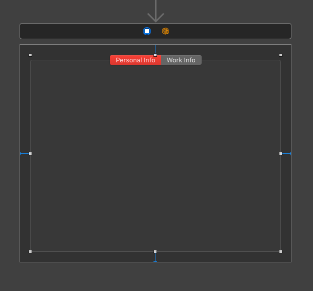
It contains two tabs, therefore two views that will contain our custom views in a while.
In the Attributes Inspector it’s possible to set a few properties, with the style being the most common as it provides options regarding the positioning of the tabs. In most cases default properties are suitable for most apps, so configuring a tab view control is rarely necessary.
The tab view you see in the main storyboard is connected to an IBOutlet property called tabView in the ViewController class. Let’s switch to the ViewController.swift file where we’ll add just a few lines of code to present our custom views. At first, declare the following two properties (instances of the custom view classes) in the ViewController class:
|
1 2 3 |
var personalInfoView: PersonalInfoView? var workInfoView: WorkInfoView? |
In the viewDidLoad() now, let’s access the two views of the tab view control:
|
1 2 3 4 5 6 |
override func viewDidLoad() { super.viewDidLoad() guard let view1 = tabView.tabViewItem(at: 0).view, let view2 = tabView.tabViewItem(at: 1).view else { return } } |
view1 is the left view and view2 the right view. On successful unwrapping, we’ll initialize the personalInfoView and workInfoView properties (our custom views) and we’ll add them as subviews to the view1 and view2 respectively:
|
1 2 3 4 5 6 7 8 9 10 11 |
override func viewDidLoad() { super.viewDidLoad() guard let view1 = tabView.tabViewItem(at: 0).view, let view2 = tabView.tabViewItem(at: 1).view else { return } personalInfoView = PersonalInfoView() personalInfoView?.add(toView: view1) workInfoView = WorkInfoView() workInfoView?.add(toView: view2) } |
In the above code you see how the add(toView:) method of the LoadableView protocol is used.
That’s it! Our demo app is ready and you can now run the app. Once you do so, see how each single control we added to both views works, and experiment with properties to change their behaviour.
Summary
The way custom views are loaded is one of the must-know things for every macOS developer, and the solution provided in this post can be used as-is in any application. Besides that, I hope you enjoyed our tour in some of the most important Cocoa controls being available to build apps in macOS. Certain controls were left aside intentionally (such as table view, outline view, and a few more), as entire posts are going to be dedicated to them. The topic of this tutorial can get a lot of experiment, so do that; experiment with the controls and their properties to find out how they behave, add more controls from the Objects Library and make your own small or big apps to practice your knowledge. I’m absolutely positive that the more you explore, the more you will like macOS programming!
For reference, you can download the complete Xcode project on GitHub.

Gabriel has been a software developer for about two decades. He has long experience in developing software solutions for various platforms in many programming languages. Since middle-2010 he has been developing almost exclusively for iOS. Tutorials consist of the best way to share knowledge with people all over the world. Follow Gabriel at Google+ and Twitter.